CSS và CSS3
Tạo Button trong CSS
Button là những nút có thể click trên trang web của bạn. Ở bài viết này, Quantrimang.com sẽ hướng dẫn cách tạo các button và giới thiệu một số button đẹp mà bạn có thể áp dụng.
Các nút kiểu dáng cơ bản
.button {background-color: #58257b; /* màu của Quản trị mạng ^^ */border: none;color: white;padding: 15px 32px;text-align: center;text-decoration: none;display: inline-block;font-size: 16px;}
Website Quản Trị MạngWebsite Quản Trị Mạng
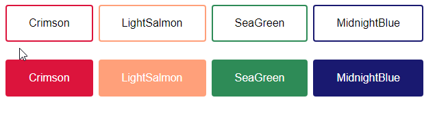
Thay đổi màu sắc cho Button
Sử dụng thuộc tính background-color để thay đổi màu nền cho các nút tạo ra:
.button1 {background-color: crimson;}.button2 {background-color: lightsalmon;}.button3 {background-color: seagreen;}.button4 {background-color: midnightblue;}.button5 {background-color: indigo;}
Code đầy đủ:
<!DOCTYPE html><html><head><style>.button {background-color: Crimson;border: none;color: white;padding: 15px 32px;text-align: center;text-decoration: none;display: inline-block;font-size: 16px;margin: 4px 2px;cursor: pointer;}.button2 {background-color: LightSalmon;}.button3 {background-color: SeaGreen;}.button4 {background-color: MidnightBlue;}.button5 {background-color: Indigo;}</style></head><body><h2>Button Color</h2><button class="button">Crimson</button><button class="button button2">LightSalmon</button><button class="button button3">SeaGreen</button><button class="button button4">MidnightBlue</button><button class="button button5">Indigo</button></body></html>
Định dạng kích thước Button
Bạn sử dụng thuộc tính font-size hoặc padding để thay đổi kích cỡ của các nút tạo ra. Dùng font-size thì button co giãn theo kích thước chữ:
.button1 {font-size: 10px;background-color: Crimson;}.button2 {font-size: 12px;background-color: LightSalmon;}.button3 {font-size: 16px;background-color: SeaGreen;}.button4 {font-size: 20px;background-color: MidnightBlue;}.button5 {font-size: 24px;background-color: Indigo;}
Sử dụng padding để thay đổi phần không gian giữa nội dung hiển thị của phần tử với đường viền của nó, thuộc tính này cũng có thể làm thay đổi kích thước của button mà vẫn giữ nguyên kích cỡ nội dung.
.button1 {padding: 10px 24px;}.button2 {padding: 12px 28px;}.button3 {padding: 14px 40px;}.button4 {padding: 32px 16px;}.button5 {padding: 16px;}
Theo mặc định, kích thước của nút được xác định bởi nội dung văn bản của nó (rộng bằng nội dung bên trong phần tử). Tuy nhiên, bạn cũng có thể dễ dàng sử dụng thuộc tính chiều rộng width để thay đổi độ rộng của nút:
.button1 {width: 250px;}.button2 {width: 50%;}.button3 {width: 100%;}
Bo tròn góc các Button
Sử dụng thuộc tính border-radius để bo tròn góc cạnh các button bằng cách xác định bán kính của các góc và bo tròn nó theo bán kính ấy.
.button1 {border-radius: 2px;}.button2 {border-radius: 4px;}.button3 {border-radius: 8px;}.button4 {border-radius: 12px;}.button5 {border-radius: 50%;}
Code đầy đủ:
<!DOCTYPE html><html><head><style>.button {background-color: Crimson;border: none;color: white;padding: 15px 32px;text-align: center;text-decoration: none;display: inline-block;font-size: 16px;margin: 4px 2px;cursor: pointer;}.button1 {background-color: Crimson; border-radius: 2px;}.button2 {background-color: LightSalmon; border-radius: 4px;}.button3 {background-color: SeaGreen; border-radius: 8px;}.button4 {background-color: MidnightBlue; border-radius: 12px;}.button5 {background-color: Indigo; border-radius: 50%;}</style></head><body><button class="button button1">2px</button><button class="button button2">4px</button><button class="button button3">8px</button><button class="button button4">12px</button><button class="button button5">50%</button></body></html>
Bạn thêm và thực hành với các thuộc tính bên trên để xem sự thay đổi nhé.
Thay đổi màu sắc viền cho Button
Bạn sử dụng thuộc tính border để thay đổi màu viền cho nút.
.button1 {background-color: white;color: black;border: 2px solid #DC143C;}...
Nút bị vô hiệu hóa
Sử dụng thuộc tính opacity để thêm độ trong suốt cho nút (tạo giao diện “vô hiệu hóa”).
Tip: Bạn cũng có thể thêm thuộc tính cursor (con trỏ chuột) với giá trị “not-allowed” để hiển thị dấu không thể click vào khi bạn di chuột qua:
.disabled {opacity: 0.6;cursor: not-allowed;}
Code đầy đủ:
<!DOCTYPE html><html><head><style>.button {background-color: #58257b; /* Green */border: none;color: white;padding: 15px 32px;text-align: center;text-decoration: none;display: inline-block;font-size: 16px;margin: 4px 2px;cursor: pointer;}.disabled {opacity: 0.6;cursor: not-allowed;}</style></head><body><h2>Disabled Button</h2><button class="button">Nút bình thường</button><button class="button disabled">Nút bị vô hiệu hóa</button></body></html>
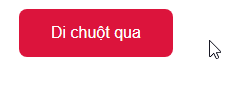
Hiệu ứng khi di chuột qua Button
Đổi màu khi hover qua nút
Sử dụng :hover selector để thay đổi kiểu nút khi bạn di chuột qua.
Tip: Nên dùng thuộc tính transition-duration để xác định tốc độ của hiệu ứng di chuột:
.button {-webkit-transition-duration: 0.4s; /* Safari */transition-duration: 0.4s;}.button:hover {background-color: crimson;color: white;}...
Code đầy đủ:
<!DOCTYPE html><html><head><style>.button {background-color: #58257b; /* Màu của Quản trị mạng ^^ */border: none;color: white;padding: 16px 32px;text-align: center;text-decoration: none;display: inline-block;font-size: 16px;margin: 4px 2px;-webkit-transition-duration: 0.4s; /* Safari */transition-duration: 0.4s;cursor: pointer;border-radius: 4px;}.button1 {background-color: white;color: black;border: 2px solid crimson;}.button1:hover {background-color: crimson;color: white;}.button8 {background-color: midnightblue;color: white;border: 2px solid midnightblue;}.button8:hover {background-color: white;color: black;border: 2px solid midnightblue;</style></head><body><button class="button button1">Crimson</button><button class="button button8">MidnightBlue</button></body></html>
Tạo Button có bóng
Sử dụng thuộc tính box-shadow để thêm bóng vào nút:
.button1 {box-shadow: 0 8px 16px 0 rgba(0,0,0,0.2), 0 6px 20px 0 rgba(0,0,0,0.19);}.button2:hover {box-shadow: 0 12px 16px 0 rgba(0,0,0,0.24), 0 17px 50px 0 rgba(0,0,0,0.19);}
- Hiệu ứng Shadow trong CSS
Nhóm gồm nhiều nút
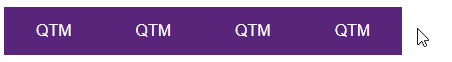
Xóa thuộc tính margin và thêm float:left vào mỗi button để nối các nút vào với nhau tạo thành nhóm như trên.
.button {float: left;}
Các nút theo nhóm đặt dọc thì sử dụng display: block thay vì float: left để các nút chồng lên nhau:
.button {display: block;}

Đặt Button nằm trên hình ảnh
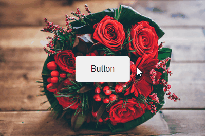
<!DOCTYPE html><html><head><style>.container {position: relative;width: 100%;max-width: 400px;}.container img {width: 100%;height: auto;}.container .btn {position: absolute;top: 50%;left: 50%;transform: translate(-50%, -50%);-ms-transform: translate(-50%, -50%);background-color: #f1f1f1;color: black;font-size: 16px;padding: 16px 30px;border: none;cursor: pointer;border-radius: 5px;text-align: center;}.container .btn:hover {background-color: black;color: white;opacity: 0.9;}</style></head><body><h2>Button on Image</h2><p>Add a button to an image:</p><div class="container"><img src="flower-1.jpg" alt="bouquet" style="width:100%"><button class="btn">Button</button></div></body></html>
Một số hiệu ứng Button đẹp
Thêm mũi tên vào nút khi di chuột vào:
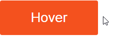
<!DOCTYPE html><html><head><style>.button {display: inline-block;border-radius: 4px;background-color: #f4511e;border: none;color: #FFFFFF;text-align: center;font-size: 28px;padding: 20px;width: 200px;transition: all 0.5s;cursor: pointer;margin: 5px;}.button span {cursor: pointer;display: inline-block;position: relative;transition: 0.5s;}.button span:after {content: '\00bb';position: absolute;opacity: 0;top: 0;right: -20px;transition: 0.5s;}.button:hover span {padding-right: 25px;}.button:hover span:after {opacity: 1;right: 0;}</style></head><body><h2>Animated Button</h2><button class="button" style="vertical-align:middle"><span>Hover </span> </button></body></html>
Thêm hiệu ứng khi nhấp chuột
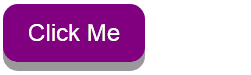
<!DOCTYPE html><html><head><style>.button {display: inline-block;padding: 15px 25px;font-size: 24px;cursor: pointer;text-align: center;text-decoration: none;outline: none;color: #fff;background-color: purple;border: none;border-radius: 15px;box-shadow: 0 9px #999;}.button:hover {background-color: #58257b}.button:active {background-color: #58257b;box-shadow: 0 5px #666;transform: translateY(4px);}</style></head><body><h2>Animated Button - Hiệu ứng nhấp chuột</h2><button class="button">Click Me</button></body></html>
Thêm hiệu ứng Fade in khi di chuột:
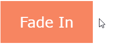
<!DOCTYPE html><html><head><meta name="viewport" content="width=device-width, initial-scale=1"><style>.button {background-color: #f4511e;border: none;color: white;padding: 16px 32px;text-align: center;font-size: 16px;margin: 4px 2px;opacity: 0.6;transition: 0.3s;display: inline-block;text-decoration: none;cursor: pointer;}.button:hover {opacity: 1}</style></head><body><h2>Hiệu ứng Fade in</h2><button class="button">Quản Trị Mạng</button></body></html>
Thêm hiệu ứng “ripple” khi nhấp chuột:
<!DOCTYPE html><html><head><style>.button {position: relative;background-color: #58257b;border: none;font-size: 28px;color: #FFFFFF;padding: 20px;width: 200px;text-align: center;-webkit-transition-duration: 0.4s; /* Safari */transition-duration: 0.4s;text-decoration: none;overflow: hidden;cursor: pointer;}.button:after {content: "";background: #f1f1f1;display: block;position: absolute;padding-top: 300%;padding-left: 350%;margin-left: -20px !important;margin-top: -120%;opacity: 0;transition: all 0.8s}.button:active:after {padding: 0;margin: 0;opacity: 1;transition: 0s}</style></head><body><h2>Animated Button - Hiệu ứng Ripple</h2><button class="button">Click Me</button></body></html>
4 Th4 2021
1 Th4 2021
30 Th3 2021
1 Th4 2021
30 Th3 2021
30 Th3 2021